
Mobile devices are actual
Tablets and other mobile devices are quickly replacing conventional desktops and also notebooks. The difference between a 27" LCD with 1960 x 1050 pixels resolution and a tablet with a touch screen and 1000 x 720 pixels is considerable. The text and buttons must be adapted to the corresponding size and mouseover features are not available on all devices.
The solution is a responsive (adaptable) design of the website or of the shop. There are tools like CSS frameworks which can help the design efficiently developing the design. A website created with a responsive design recognises the properties of the screen and displays the website always optimal in resolution and operation.
We're using for this Bootstrap. The framework has been heavily enforced as usually employed and is now in the third Version. Bootstrap is a grid-based framework and has corresponding data for various output devices. It can thereby determine how the site needs to be implemented.
Example: travel agency website - Crystal Travel
The new website of the travel agency Crystal Travel was systematically implemented on responsive design. In this working field, there is a very high probability that a prospective buyer accesses the website from a mobile device - a customer is stuck at an airport and wants to make contact with the travel agency.
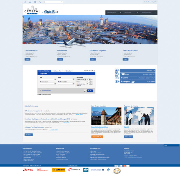
The picture above shows the site on a large monitor dektop with HD TV resolution. The content is adapted to the size of the monitor, great teaser image and generous sharing of content.
The website on a small monitor, tablet

If the site is displayed on a smaller monitor with resolution of 1024 pixels, or tablet with appropriate resolution, the teaser image is reduced and the lateral background is discarded. The navigation buttons are proportionately greater for finger operation and texts are legible.
The website on mobile devices
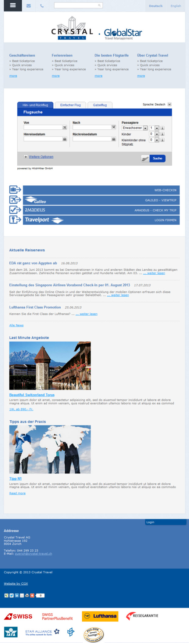
For mobile devices with screen resolution of 1000 pixels resolution, the navigation is structured differently and the whole website is presented in only one column. The sequence can be specified exactly.
Navigation with mobile devices
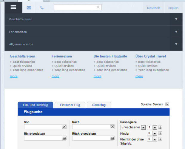
The navigation is adjusted according to the operating system of the device and arranged so that a smooth navigation with the touch screen is possible.